The Psychology of Color in Branding
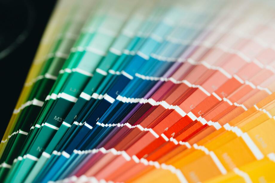
Color accounts for up to 90% of a consumer’s first impression of a brand. It’s one of the fastest ways to communicate your identity and values. Here’s why colors play such a critical role:
Emotional Connection
Colors evoke emotions on a subconscious level. For example, green often symbolizes growth and harmony, while red can ignite excitement or urgency.
Recognition and Memory
A consistent color palette makes your brand more recognizable. Studies show that color improves brand recognition by up to 80%.
Perception of Value
Colors can also influence how premium or affordable your brand feels. Black and gold often signify luxury, while orange and green suggest affordability and approachability.
The Psychology Behind Popular Colors
Let’s break down the psychological impact of some of the most commonly used colors in branding and what they communicate:
Red: Energy and Passion
Psychological Impact: Red is an attention-grabber. It evokes feelings of excitement, urgency, and passion, making it a popular choice for sales or fast-food brands.
Brands That Use It: Coca-Cola, Netflix, McDonald’s.
When to Use: Use red when you want to create a sense of urgency or excitement, especially for sales promotions or high-energy campaigns.
Blue: Trust and Reliability
Psychological Impact: Blue evokes calmness, trust, and professionalism. It’s commonly used by financial institutions and tech companies.
Brands That Use It: Facebook, IBM, Samsung.
When to Use: Blue is ideal for brands that want to build trust and convey stability, such as healthcare, finance, or technology industries.
Yellow: Optimism and Cheerfulness
Psychological Impact: Yellow radiates positivity and warmth. However, it should be used sparingly, as too much yellow can cause anxiety.
Brands That Use It: McDonald’s, Ikea, Snapchat.
When to Use: Perfect for brands targeting younger audiences or those that want to evoke happiness and energy.
Green: Growth and Sustainability
Psychological Impact: Green is often associated with nature, health, and wealth. It’s the go-to color for eco-friendly and financial brands.
Brands That Use It: Starbucks, Whole Foods, Spotify.
When to Use: Use green to align with sustainability efforts or to promote relaxation and well-being.
Black: Sophistication and Luxury
Psychological Impact: Black is sleek, elegant, and powerful. It often symbolizes exclusivity and luxury.
Brands That Use It: Chanel, Nike, Apple.
When to Use: Black is ideal for high-end brands that want to exude sophistication and timelessness.
Orange: Energy and Playfulness
Psychological Impact: Orange combines the excitement of red with the warmth of yellow. It’s vibrant, fun, and approachable.
Brands That Use It: Fanta, Harley-Davidson, Nickelodeon.
When to Use: Use orange to appeal to younger demographics or when promoting energetic, creative brands.
Purple: Creativity and Royalty
Psychological Impact: Purple has long been associated with luxury, creativity, and wisdom.
Brands That Use It: Cadbury, Hallmark, Yahoo.
When to Use: Great for brands in the creative, luxury, or wellness industries.
How to Choose the Right Colors for Your Brand
Choosing the perfect color palette for your brand involves more than just picking your favorite hues. Here’s how to make an informed decision:
Understand Your Brand’s Personality
Is your brand bold and adventurous, or calm and trustworthy? Choose colors that reflect your core values and mission. For instance, a tech startup may lean toward blue for trust, while a fitness brand might opt for red to convey energy.
Know Your Target Audience
Demographics play a role in color perception. For example, younger audiences might prefer vibrant, playful colors like orange and yellow, while older, professional audiences may resonate more with blues and greys.
Consider Industry Trends
Look at what’s common in your industry—but don’t be afraid to stand out. While green dominates eco-friendly brands, a bold purple might make your sustainable company more memorable.
Test Your Palette
Once you’ve narrowed down your options, test your colors in different contexts. How do they look on your website, packaging, or social media? Conduct A/B testing to see which resonates best with your audience.
Using Colors Strategically Across Platforms
Your color palette should remain consistent across all branding touchpoints, but how you use it may vary depending on the platform:
Web Design
Use colors to guide user behavior. For example, highlight CTAs (like "Buy Now" buttons) with contrasting colors that draw attention.
Social Media
Create a cohesive feed by using your brand colors consistently in posts, stories, and highlights.
Packaging and Print Materials
Ensure that your physical branding elements reflect the same visual identity as your digital platforms.
Events and Campaigns
When launching a campaign, consider adding a temporary accent color to complement your existing palette and create excitement.
Common Mistakes to Avoid
Overloading on Colors
A busy palette can confuse your audience. Stick to 2–3 primary colors with a few accents for balance.
Ignoring Accessibility
Ensure your colors have enough contrast to be legible for all users, including those with visual impairments.
Being Inconsistent
Using different shades or tones of your brand colors across platforms can dilute your identity.
The psychology of color in branding is both an art and a science. By understanding the emotional and psychological impact of colors, you can create a brand identity that not only looks good but resonates deeply with your audience. Whether you’re building trust, sparking excitement, or promoting sustainability, your choice of colors is a powerful tool in shaping perception and driving engagement.
Ready to create a color palette that tells your brand’s story? At M de Milho, we specialize in crafting unforgettable visual identities. Let’s make your brand stand out—contact us today.